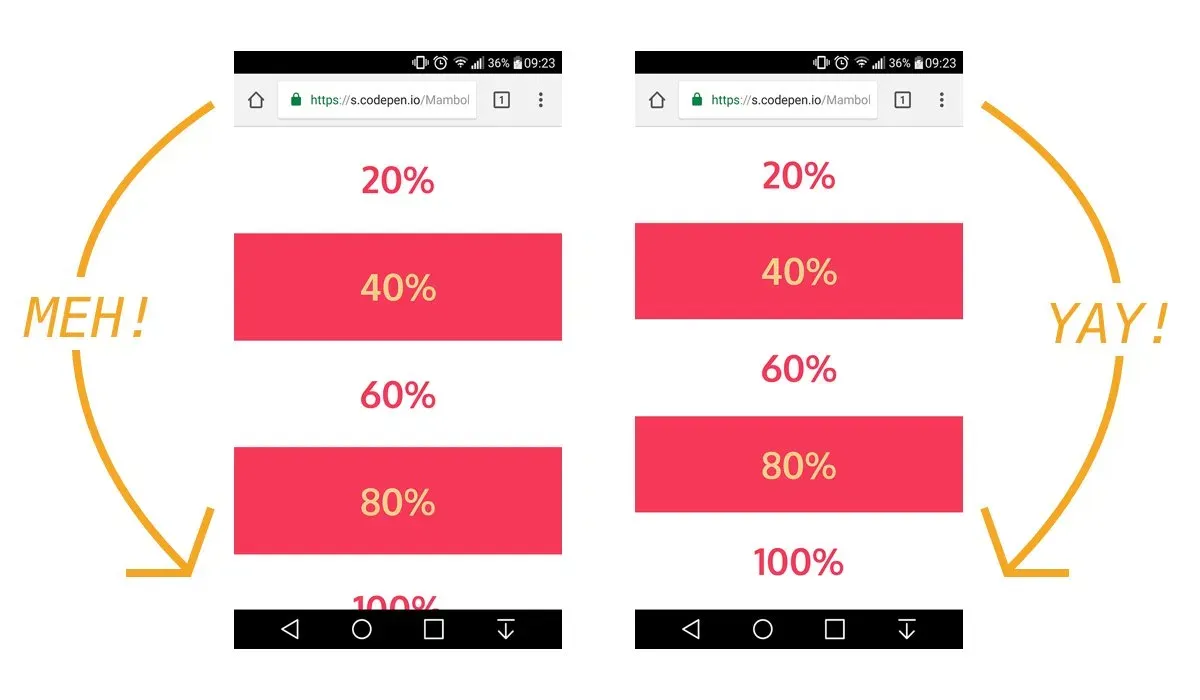
On mobile if you set your body height to 100vh it would be greater than 100vh due to the address bar
Solution to fix this is to create a --var via a js script and set it up in the :root instead of solution proposed on css-trick i decide to set a custom unit and no rewrite vh default unit
/*
* Purpose of this script is to fix 100vh bug on mobile browser when address bar is open see :
*/

// First we get the viewport height and we multiple it by 1% to get a value for a vh unit
// and set this value to RealHeight variable

let rh = window.innerHeight * 0.01;

// Then we set the value in the --rvh custom property to the root of the document

// document.documentElement.style.setProperty('--rvh', `${rh}px`);

const headTag = document.getElementsByTagName('head')[0];
const styleTag = document.createElement("style");

styleTag.innerHTML = `
	:root { --rvh: ${rh}px}
`;

headTag.appendChild(styleTag);
you can use it in your css
.body {
	display: flex;
	flex-direction: column;
	justify-content: space-between;
	align-items: center;

	/* Fallback for browsers that do not support Custom Properties */
	height: 100vh;
	/* fix for address bar on mobile 100vh != 100vh */
	height: calc(var(--rvh, 1vh) * 100);
}
source: